
Graphic design is a discipline known for its ability to combine creativity and functionality. In a world saturated with visual information, the ability to communicate a message clearly and attractively is more important than ever. Graphic design is not limited to creating images and layouts—it encompasses a series of principles that ensure visual communication is both effective and impactful. In this context, balancing function, aesthetics, and communication becomes essential to the success of any graphic design project.
In this article, we’ll explore the principles that guide graphic design and how they can be applied to create work that not only draws attention but also conveys the intended message. We’ll also discuss the advantages of efficient design and provide tips on how to create balanced visuals. By the end, you’ll be better prepared to understand and apply graphic design concepts in your own creative projects.
How Graphic Design Principles Work
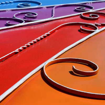
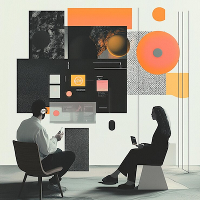
Graphic design principles are fundamental for creating effective visual communication. They include elements such as balance, contrast, hierarchy, alignment, repetition, and proximity. Each of these plays a crucial role in how information is perceived and understood. For example, balance refers to the visual distribution of elements in a composition, ensuring that no part feels too heavy or disproportionate. This can be achieved through symmetrical balance, where elements are evenly placed, or asymmetrical balance, which uses varying sizes and weights to create harmony.
Contrast helps highlight key elements and generate visual interest. By using different colors, shapes, and sizes, a designer can direct the viewer’s eye to the most important areas. Hierarchy, or the organization of elements by importance, is also key. A well-designed piece leads the viewer naturally from the most important to the supporting information.
Alignment refers to how elements are arranged in relation to each other. Well-aligned designs feel structured and organized, while poor alignment can create confusion and reduce impact. Repetition uses recurring visual elements—like color, typography, and shapes—to build cohesion. Proximity, meanwhile, helps group related content together, aiding readability and flow.
Mastering and applying these principles effectively is what separates good graphic designers from exceptional ones. They aren’t rigid rules, but adaptable guidelines that should be interpreted based on each unique project. Regular practice and critical analysis of existing work are essential to developing these skills.
Advantages of Efficient Graphic Design
Efficient graphic design brings a wide range of advantages that can directly impact the success of a project. First and foremost, it enhances visual communication. When a design is well-crafted, its message becomes clear and easy to understand, making it more accessible to the target audience. This is especially important in a competitive, attention-fragmented world, where standing out can make all the difference.
Efficient design also plays a key role in building brand identity. Consistent visual elements—like logos, color palettes, and typography—help establish a cohesive image that the public can easily recognize. A strong visual identity builds trust and credibility, making a brand appear more professional and reliable.
Another major benefit is the ability to influence consumer perception. A well-executed design can evoke emotions and positive associations, shaping how people feel about a product or service. For instance, warm colors might convey energy and warmth, while cool tones can create a sense of calm and trust. By understanding color psychology and visual cues, designers can craft pieces that resonate emotionally with their audience.
Finally, effective graphic design can boost conversion and sales. A design that is both visually appealing and functional can guide users through a journey—encouraging them to take actions like making a purchase or signing up for a service. This is especially critical in digital environments, where design often determines whether a user stays or leaves.
How to Create Graphic Design That Balances Function and Aesthetics
Creating graphic design that balances function and aesthetics requires a deep understanding of both the project’s goals and the audience’s needs. The first step is to define the purpose of the design. Ask yourself: What message do I want to communicate? Who is my audience? What actions or emotions do I want to provoke? Having clarity on these questions will inform all your visual decisions.
Once the purpose is clear, you must select visual elements strategically. This includes choosing colors, fonts, images, and layouts that are not only visually appealing but also serve the design’s function. For example, in a poster for an event, the date and location should be highlighted through effective contrast and visual hierarchy.
Simplicity is a powerful ally in graphic design. Often, less is more. Avoiding clutter and excessive detail can help keep the focus on the main message. A clean, organized design makes reading and comprehension easier, allowing the viewer to absorb information more effectively.
Finally, testing and feedback are critical. Present your work to colleagues or focus groups to gather input on how your design is perceived. Adjustments based on this feedback can be the key to achieving the ideal balance between function and aesthetics—ensuring your design not only looks good but also communicates clearly and effectively.
Did You Enjoy Learning About Graphic Design: Balance Between Function, Aesthetics, and Communication?
Graphic design is a fascinating and dynamic field that uniquely blends art, technology, psychology, and communication. It is not just about making things look attractive—it’s about solving problems, shaping perception, and delivering meaning through visuals. Every color, shape, line, and font plays a role in how messages are understood and remembered. Through design, we influence emotions, guide decisions, and connect with people across cultures and contexts.
By understanding the core principles of strong design—balance, hierarchy, contrast, alignment, and unity—you can begin to create visual experiences that are not only beautiful but also purposeful. When form and function are aligned, design becomes a powerful storytelling tool—one that transcends language and speaks directly to the human experience. The ability to balance function and aesthetics isn’t just a technical skill; it’s a creative philosophy that can transform how we communicate, build brands, and shape the world around us.
If you found this topic inspiring, don’t stop here. Dive deeper into the rich and ever-evolving world of graphic design. Study classic design movements and emerging trends. Observe how visual identities shape everyday life—from packaging and social media to public signage and editorial layouts. Experiment with tools, play with ideas, and seek feedback from other creatives.
Graphic design is a lifelong journey of exploration and expression. It challenges us to see differently, to think visually, and to connect meaningfully. Striving for harmony between function, aesthetics, and communication isn’t just a design goal—it’s a mindset that empowers you to bring clarity, beauty, and intention to everything you create.
So keep learning, keep creating, and keep pushing boundaries. Your next design could inspire, inform, or even change the way someone sees the world.
Frequently Asked Questions
What is graphic design?
Graphic design is the art of communicating ideas visually. It combines images, text, and color to deliver a message that’s clear and appealing.
Why is balance important in graphic design?
Balance makes a design more pleasant and readable. It helps the viewer process information more easily. Without it, a design can feel chaotic or confusing.
How does aesthetics affect graphic design?
Aesthetics are about how a design looks. A beautiful design captures attention and makes people more interested in the message it conveys.
What does function mean in graphic design?
Function is the purpose behind the design. Every element should serve a role. That’s how graphic design: balance between function, aesthetics, and communication is achieved.
How can I start learning graphic design?
You can start by exploring online tutorials, taking free or paid courses, and studying the fundamentals of design—such as typography, color theory, and composition. Practicing with real projects and finding inspiration in the work of other designers is also a great way to grow and develop your skills.